Ink isn’t just ink. It’s mood, personality, and story — all bottled up and waiting to splash across a tee. At Tiny Little Monster, we’ve seen how the right color combo can turn a simple design into a head-turner, and how the wrong one can… well, let’s just say it ends up in the pajama drawer.
So let’s pull back the curtain and reveal the secret life of ink — how it works, how to use it, and how to make your next custom shirt shine.
Why Color Matters More Than You Think
Color is the first thing people notice. Before they read your logo or laugh at your clever slogan, they react to the colors.
- Emotion: Blues calm, reds energize, yellows brighten.
- Visibility: Bright, bold colors stand out in a crowd (hello, festival season).
- Memory: Colors stick — think “Coca-Cola red” or “Cardinals red.”
When you’re choosing colors for merch, you’re choosing the vibe people will carry with them long after the event.
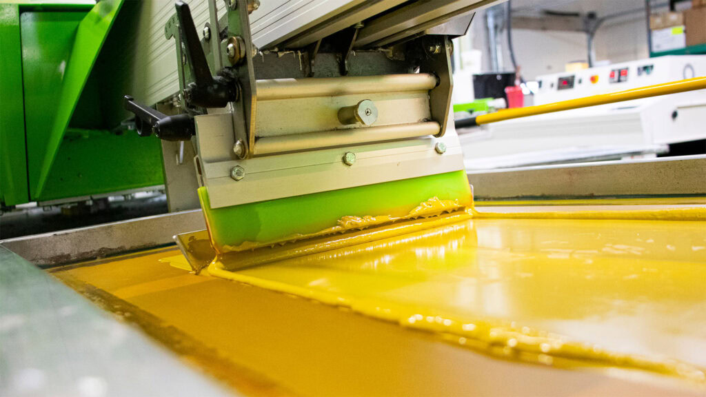
How Ink Behaves on Fabric
Not all inks are created equal, and not all fabrics treat ink the same way.
- Light vs. Dark Shirts: Printing yellow ink on a white shirt? Easy. Printing yellow on black? That takes special underbase layers to pop.
- Fabric Content: Cotton loves ink. Poly blends? They need a little coaxing to keep colors vibrant.
- Special Effects: Puff ink, metallics, glow-in-the-dark — each one has its own personality.
That’s why working with a local print shop (hey, that’s us) matters. We know which inks will behave best for your design and your shirt choice.
Top 5 Color Combos That Always Work
Need inspiration? Here are some tried-and-true palettes that never disappoint:
- Classic Black & White – Timeless, bold, always readable.
- Arch at Sunset – Golds, oranges, and deep blues inspired by St. Louis skies.
- Retro Pop – Hot pink, teal, and neon green for a funky, throwback vibe.
- Forest Park Greenery – Fresh greens with earthy browns for eco-minded events.
- Minimal Monochrome – Different shades of the same hue for a sleek, modern look.
Common Ink Mistakes to Avoid
We love color experiments, but there are pitfalls to watch out for:
- Too Many Colors: Overcomplicates the design and adds cost.
- Low Contrast: Light ink on light shirts (or dark on dark) can make designs invisible.
- Ignoring the Fabric: Not all inks pop the same way across different shirt types.
The secret? Less is usually more — and the right combo can say more than a rainbow explosion.
Custom Color Matching: Bring Your Brand to Life
Got a brand color you must stick to? We can custom mix inks to nail your exact shade — from “Cardinal red” to “River Des Peres brown.” This ensures your merch is consistent, professional, and instantly recognizable.
FAQs: Choosing Ink Colors for Custom Shirts
Q: How many colors should I use in my design?
A: Most designs look best with 2–3 colors, but we’ll help you decide what works for your budget and vision.
Q: Can you print neon or metallic inks?
A: Absolutely. We offer specialty inks like metallics, puff, and glow-in-the-dark to give your design extra flair.
Q: What if my shirt color clashes with my design?
A: We’ll guide you through picking the best shirt-to-ink combo so your design pops instead of fades away.
Q: Can you match my brand’s Pantone color?
A: Yes! We do custom mixing to make sure your tees stay on-brand, for a small mixing fee.
Q: What’s the most popular ink color?
A: Believe it or not, white ink on black tees still rules the world — but funky combos are always welcome here.
Let’s Bring Your Colors to Life
Your design deserves to be more than just “okay.” It deserves to pop, shine, and tell your story in living color. At Tiny Little Monster, we’ll help you pick the perfect palette and print it with pro quality — so your shirts turn heads for all the right reasons.
Ready to see your colors come alive?
Request a quote today and let’s make some magic in ink.